Kitchen Inspiration
I stumbled upon an inspiring photo in Elle Decor a few years ago when we were in the process of renovating our kitchen. It was just the corner of a room, but unlike a lot of the spaces featured in shelter magazines, it looked like someone lived there. There was childrens' artwork on the refrigerator (tastefully arranged), some raffia wallpaper covering a small desk area, and a round table surrounded by red Eames chairs. The Eames part of those red chairs was not in the budget, but I stuck that photo to my bulletin board and it got the ball rolling on the designing. Nevermind that I didn't pay an ounce of attention to the dishwasher door blocking the cabinets (forcing us to put away our glasses in two steps) or the fact that it will be the year 2029 before my children will be able to reach to the ice tray in the freezer or be able to open the 200-pound pull-out pantry door by themselves. I got my red chairs and I love my kitchen to this day.
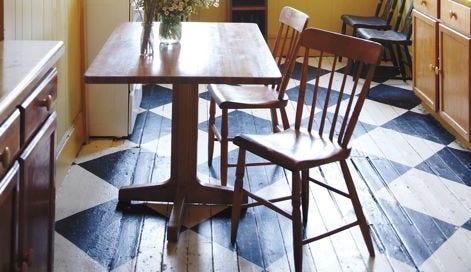
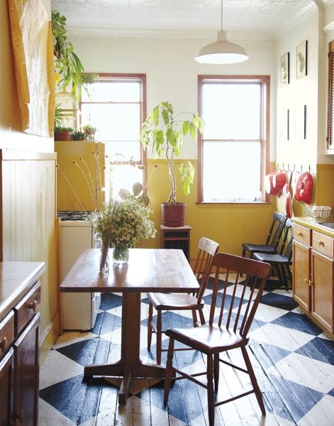
But I love the kitchens featured in Design*Sponge's at Home -- the book based on the blog that everyone except maybe two people in the world are obsessed with -- even more. Grace Bonney, the founder and author, takes the concept of inspiration to a whole new level here with page after page of gorgeous personal spaces along with personal stories that explain how the lucky owners managed to execute their visions. The kitchens, of course, were my favorite. For instance, if I had stumbled upon the photo above a few years ago, there is a 100% chance that I'd be sitting in a yellow kitchen with a painted checkerboard floor right now.
Artisan was nice enough to send along a sneak peak of some of the kitchens featured in Design*Sponge At Home and to celebrate its publication, DALS is giving away a free copy of the book to one lucky commenter below*. Winner will be chosen at random next week, but special consideration goes to anyone who shares a cool family kitchen design idea. Even special-er consideration goes to any commenter who follows DALS on facebook.
I love the red on red here. It's the 2011 answer to Julia Child's museum-worthy pegboard.
I have white cabinets, subway tiles, marble countertops, and yet...my kitchen does not remotely resemble this one. It must be the floor -- would you look at how cool those tiles are? Well, the floor and the wine. Mine is always much more accessible.
Can you see the chalkboard panel attached to the side of the refrigerator? How fun would that be for a kid?
My favorite detail in this one: The little reading nook. Phoebe would lose her mind.
*Thanks for playing everyone. Lori wins the book.